


Retzef
W'17
Three SaaS products on one website
Retzef brings automation, analytics and teamwork together. I gave each product a place on the page so a team arriving with one job in mind can find its starting point.
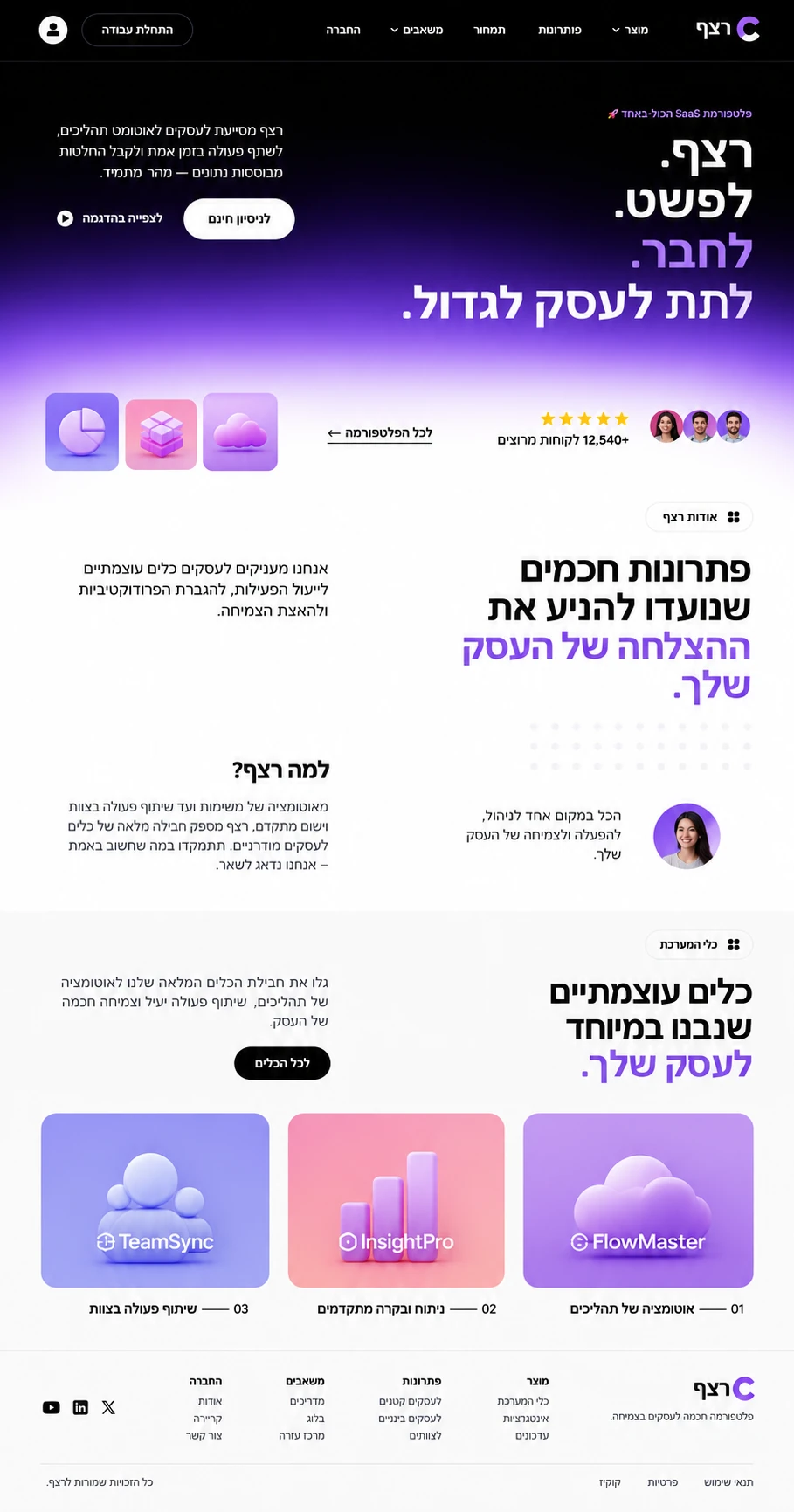
A name, number and colour distinguish FlowMaster, InsightPro and TeamSync even when all three appear together.
Project results
- Increase in free trial sign-ups
- 64%
- Decrease in homepage bounce rate
- 31%
- Average time spent, in seconds
- 167
Try it now or watch it in action?
A manager familiar with FlowMaster can start a trial. A colleague seeing InsightPro and TeamSync for the first time can watch the demo before signing up.
What the business needed
Retzef needed a Hebrew site that could present three distinct tools as one platform. The challenge was to retain the feel of an international SaaS product in a right-to-left layout.
What I built into the site
- The opening moves from black to glowing violet alongside a promise to simplify work and connect the business.
- The trial button sits beside a star rating and a counter labelled “12,540+ satisfied customers”.
- A free trial and a product demo serve visitors at different stages of their decision.
- Product cards 01–03 each have a distinct colour and three-dimensional icon.
- Type, spacing and reading order were designed for Hebrew from the outset.
Why invest in the design of a SaaS website?
On Retzef, typography and colour distinguish the three tools. Placing a trial and a demo beside the explanation gives visitors a way to judge the software for themselves.
Do several products need to share your homepage?
Discuss my website →