


Kis
W'20
Showing a payments app before the download
Kis handles payments, savings and transfers. I put the balance and recent activity on a phone screen so visitors can inspect the interface before downloading.
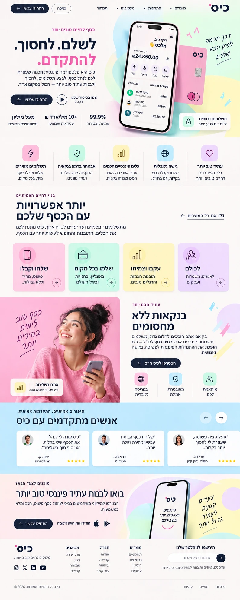
Alongside the account preview I included examples for a business owner, a student and a freelancer. The page ends with download options for iPhone and Android.
Project results
- Increase in app downloads from the website
- 41%
- Increase in newsletter sign-ups
- 57%
- Decrease in campaign cost per lead
- 29%
What will the account look like?
A freelancer comparing ways to track payments can inspect the account view, read a usage example and choose the store for her phone.
What the business needed
Kis serves people who want to pay, save and send money abroad. The site needed an approachable tone and a clear view of what opening the account would mean.
What I built into the site
- The final word in the three-part headline about paying, saving and moving forward is highlighted in pink.
- The site's information strip displays labels for 99.9% reliability, over ₪10 billion in transactions, more than a million users and safe payments.
- The phone preview shows a balance, recent activity and a payment card.
- Pastel colours and a handwritten line about the next chapter soften the interface.
- The user stories cover a small-business owner, a student and a freelancer.
- The download path ends with a choice of the App Store or Google Play.
How do you build trust on a fintech website?
Kis pairs an account preview with trust information near the action and examples of everyday use. Reliability figures on a financial website should come from current company records.
Should people see inside your app before they download it?
Discuss my website →